
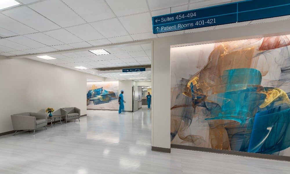
 Directional signage at Virginia Hospital Center features a clear font with high-contrast brand colors, making it easier to read. Eye-catching artwork serves as a visual cue that visitors are on the right path. Credit: Jeffrey Sauers, CPI Productions
 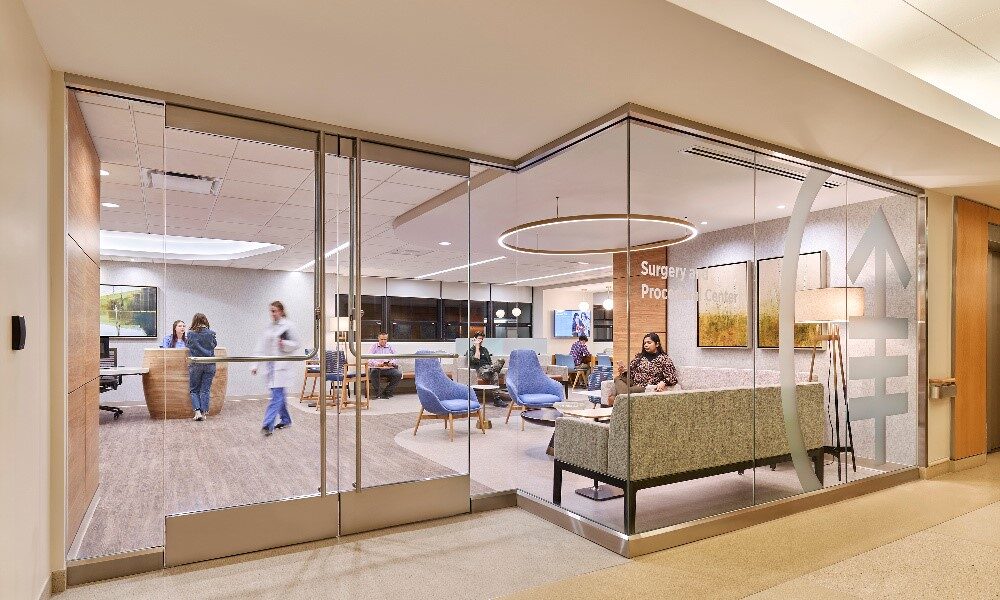 This modernized surgery center features updated signage etched in glass, allowing passersby to peer into the newly renovated space. An oversized logo reinforces the brand. Credit: Edward Caruso Photography
 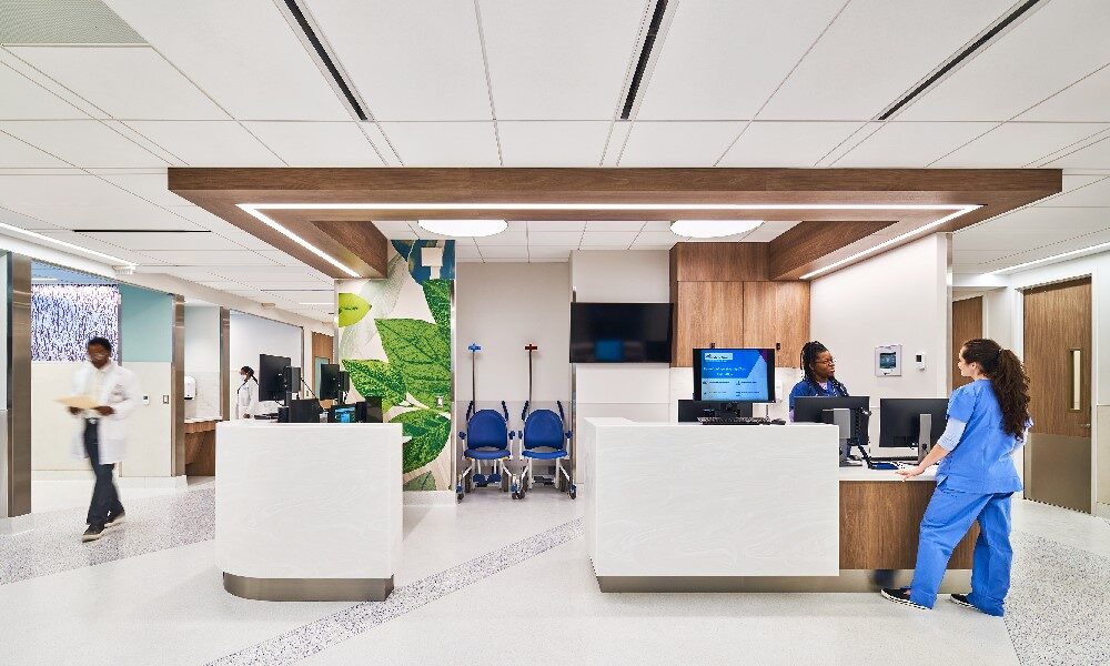 Mount Sinai Hospital. Credit: Edward Caruso Photography
 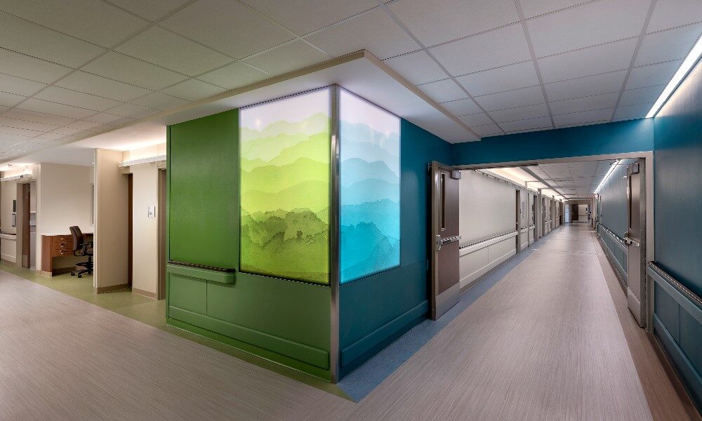 Back-lit resin panels reinforce wayfinding at ValleyHealth Winchester Medical Center. Credit: Jeffrey Sauers, CPI Productions
 Subscribe Now


More Than a Sign
By Rika Gunawan and Julie Bellino
Navigating healthcare spaces with ease
Before learning to read or speak, children typically learn to communicate visually. Traveling in a foreign country, we often seek common symbols to locate the nearest restroom or exit. Pictures are a universal language. Employing visual cues in healthcare settings is a critical design tool to establish wayfinding, support safety measures and create a cohesive brand identity. Visual cues are not limited to signage and symbols used for wayfinding, and can be incorporated through wall and floor finishes, ceiling treatments and light fixtures.
The purpose of including signage as wayfinding in these facilities is to create a smooth operational flow, and to provide a better visitor experience by providing clear direction. Ultimately, wayfinding is spatial problem solving, which in a healthcare setting can have a major impact on patient outcomes. Directional signage should be clear, concise and aesthetically pleasing. Wayfinding can be reinforced through visual cues such as color, artwork, ceiling finishes and floor patterns.
Client brand and patient population
The first step in incorporating visual cues into healthcare spaces is to understand the client’s brand, as well as the patient population. Brand elements can be integrated into the project in several ways. The selected color palette can be adjusted to either complement or echo brand standards. The client logo can be added to directional signage, or it can be subtly incorporated through fabric and finish selections.
For example, when a hospital sought to relocate and modernize existing services, the designers opted for interior glazing at the entrance. In lieu of traditional signage, the clinic name and an oversized logo are etched into the glass. This approach reinforces the brand while supporting the client’s goal for a refreshed, modern appearance.
Designing inclusive spaces that meets the needs of all users requires designers to understand the patient population and consider factors such as age, ability, gender, culture and ethnicity, socio-economic status, education, geographic location and language. This information informs wayfinding needs to foster an environment where patients, visitors and staff feel safe and comfortable.
When you are experiencing a medical emergency, even something as simple as seeing a welcome sign in your primary language can make you feel more comfortable. Identifying the healthcare system’s primary languages can serve as a basis for creating multi-lingual signage that the majority of visitors will understand. Interactive signage placed at critical junctions provides an opportunity for users to select their preferred language and can help with self-navigation and patient registration.
Accommodate accessibility
As designers, it is up to us to accommodate all abilities through accessible wayfinding and go beyond what is required by the ADA. From flooring to stairwells, high-contrast finishes make navigation easier for visually impaired individuals. Emphasize borders by selecting a high-contrast finish for baseboards, door frames and doors; further, select a darker color for the stair tread than the rises. Directional signage should feature clear, large lettering to improve readability. Create a route that can be easily followed by embedding arrows or a contrasting strip of color within floor patterns.
Notably, incorporating accessibility features into the built environment helps everyone navigate healthcare spaces easier, regardless of ability.
Color code for self-navigation
The Glickman Lauder Center of Excellence in Autism and Developmental Disorders in Maine employs a color-coding system to support wayfinding. Classrooms feature an accent wall in one of four colors, which matches the finish on the corresponding corridor wall. For example, to find the yellow classroom, participants enter the door in the yellow wall. This encourages self-navigation while maintaining a playful, child-friendly environment.
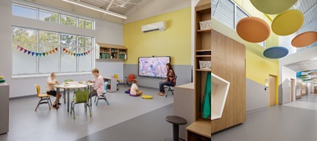
At Maine Behavioral Health’s Glickman Lauder Center for Excellence in Autism and Developmental Disorders, designers developed a color-blocking theme to encourage self-navigation. Photographer: Ben Gancsos
Visual elements
One project that took wayfinding beyond traditional signage was the renovation of neuro/ortho units at ValleyHealth’s Winchester Medical Center in Winchester, Virginia. The unit features two bright, saturated colors on inner core walls to differentiate the two departments and reinforce wayfinding. The neurology department features an orchard theme with apple green walls, while orthopedics is marked by a mountain theme with teal walls. Floor pattern accents and back-lit resin panels in apple green and teal at key junctions further reinforce the concept.
Adding memorable visual elements can support self-navigation, add visual interest and foster a sense of warmth and familiarity. This can be achieved in many ways and is not limited to overhead signage. Ceiling treatments can indicate information desks, nurse station and points of entry or egress. Choose a contrasting finish, play with various shapes and integrate lighting to attract the viewer’s eye. At New York City’s Mount Sinai emergency department, rectangular ceiling treatments with a wood-like finish and recessed lighting indicate nurse stations throughout the facility.
Promote healing
When designing any healthcare facility, the ultimate goal is to foster an environment that will limit stressors to promote healing. Clear visual cues will create a smoother experience for visitors, and will support more efficient operational flow for caregivers. The facility design should create a sense of harmony and calm, to make an otherwise stressful experience as pleasant as possible. As designers, we must look beyond the floor plan and interior finishes to focus on the visitor experience from registration through discharge.
Author: Rika Gunawan and Julie Bellino
Rika Gunawan, NCIDQ, LEED AP, is a certified interior designer at E4H Environments for Health Architecture. Julie Bellino is marketing manager at E4H Environments for Health Architecture.
Posted March 14, 2023
More Articles:
- CxA Workshop & Exam
Apr 29, 2024 – Apr 30, 2024 - EMP Seminar & Exam at CxEnergy 2024
Apr 29, 2024 – Apr 30, 2024 - CxEnergy
Apr 29, 2024 – May 2, 2024 - PHCC West 2024
Apr 29, 2024 – May 2, 2024 - Lean in Design Forum 2024
May 1, 2024 – May 2, 2024 - IFMA’s Facility Fusion Conference & Expo
May 5, 2024 – May 7, 2024 - ASHE Academy 2024
May 6, 2024 – May 10, 2024