Refreshing the Space: Lowell General Renovation Boasts Hospitality-Like Interiors
Whenever an opportunity to revitalize an existing medical campus presents itself, the rewards associated with re-establishing a brand can be high, but the design challenge can itself be daunting. While greenfield sites present their own array of challenges, a revitalization project carries a number of design issues associated with existing perception. While there are a great many issues to undertaking a complex renovation, ultimately, the most important initial question to ask is “why?”
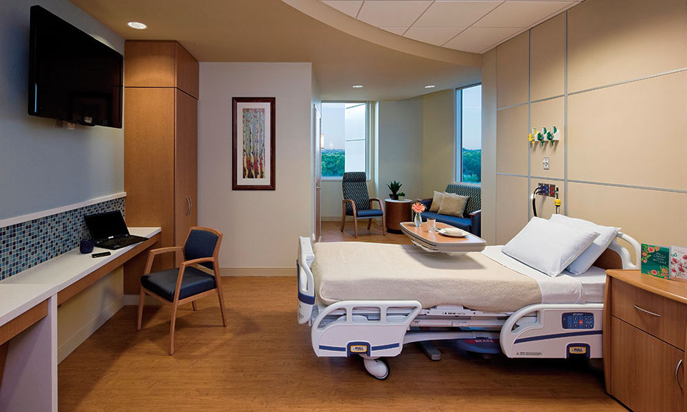
In the case of Lowell General Hospital, rather than launch a complete re-branding effort, the facility’s renovation instead offered the opportunity to reinforce the client’s already established mission. Consequently, the renovation of its interiors with more hospitality-like features became the avenue to refresh the space and remind the community of its commitment to service.
Just because an aging medical campus needs renovations, either for operational purposes or simply aesthetic upgrades, does not mean it needs a complete makeover. Critical to the design process is a preliminary dialogue with the client to assess the current state of a brand. Where are they in the marketplace, how are they perceived and who is their base clientele? Evaluating these questions helped designers establish the magnitude of the change and how far to carry the work.
Lowell General Hospital
During an initial assessment of Lowell General Hospital, it became clear the team was working with an aging medical campus in need of aesthetic upgrades, modernization in operational flow and some fresh ideas. In general, the institution had built a well-established position in the community and a reputation for excellent customer service. Therefore, the renovation would not be a re-branding exercise, but a reinforcement of the client’s mission statement.
Lowell, a small historic town located 30 minutes northwest of Boston, Mass., was established in 1655 as one of the oldest settlements on the east coast. It is rich with history and has strong ties to its legacy as the birthplace of the American industrial revolution. Known especially for its textiles, Lowell has a proud tradition of craftsmanship, dedication to the arts and sense of community.
Its hospital, established in 1891, has faithfully served Lowell for more than 100 years and has earned a reputation for family centered care. To begin its revitalization, the project team assessed the current aesthetic state of the facility, deciphered what gave the medical center its sense of identity and worked with that palette to strengthen an established brand.
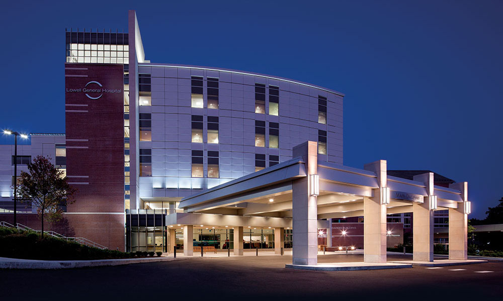
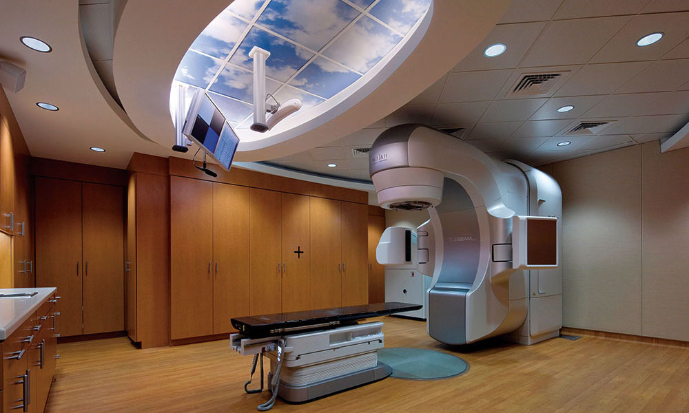
After successfully completing a facility master plan, RTKL developed the initial phase of the work: a new, 190,000-gross-square-foot hospital expansion to provide outpatient services and 90 inpatient beds. The project featured a new entry point for outpatient services, creating a more operationally efficient and patient-friendly access point for this key client type. In addition to reinforcing the brand, the project provided space to support outpatient services more associated with hospitality than healthcare. Additionally, the team strived to construct a venue that actively celebrates the strong ties to Lowell and its history. Key concepts were:
Locally recognizable language
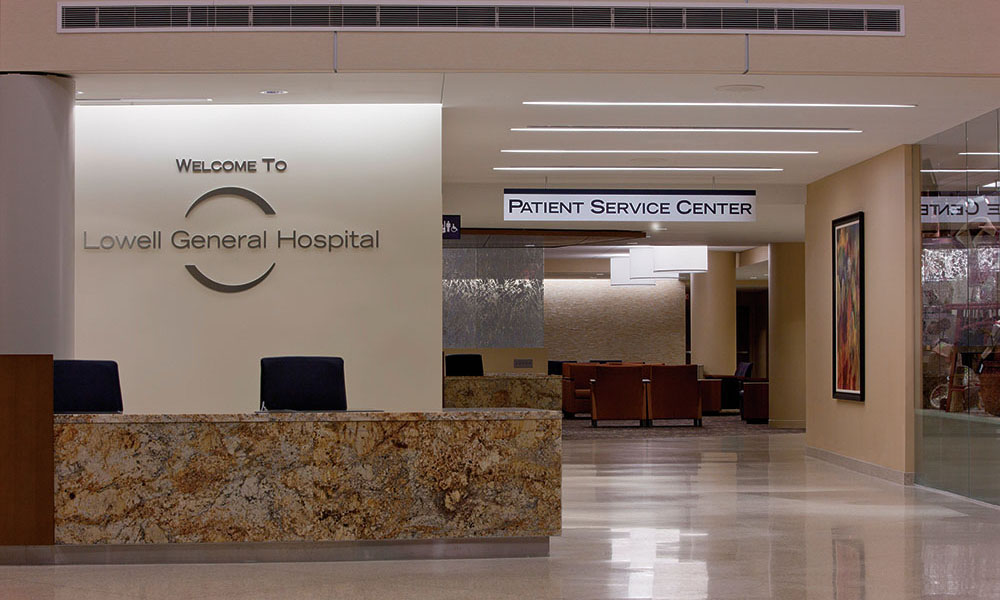
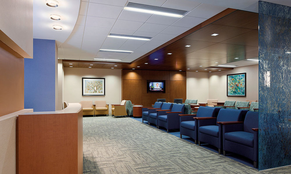
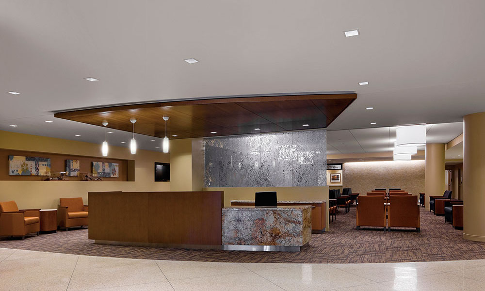
The decision to remain in context on the exterior of the building, using traditional brick construction, was an easy one, but internally, the team wanted to celebrate the strong nature of the region’s buildings by using a palette of wood and stone. These finishes, balanced with a subtle color palette, allowed the interior to feel warm and strong, while a mixture of natural light and glass partitions lightened the aesthetic.
Celebrate textiles as inspiration
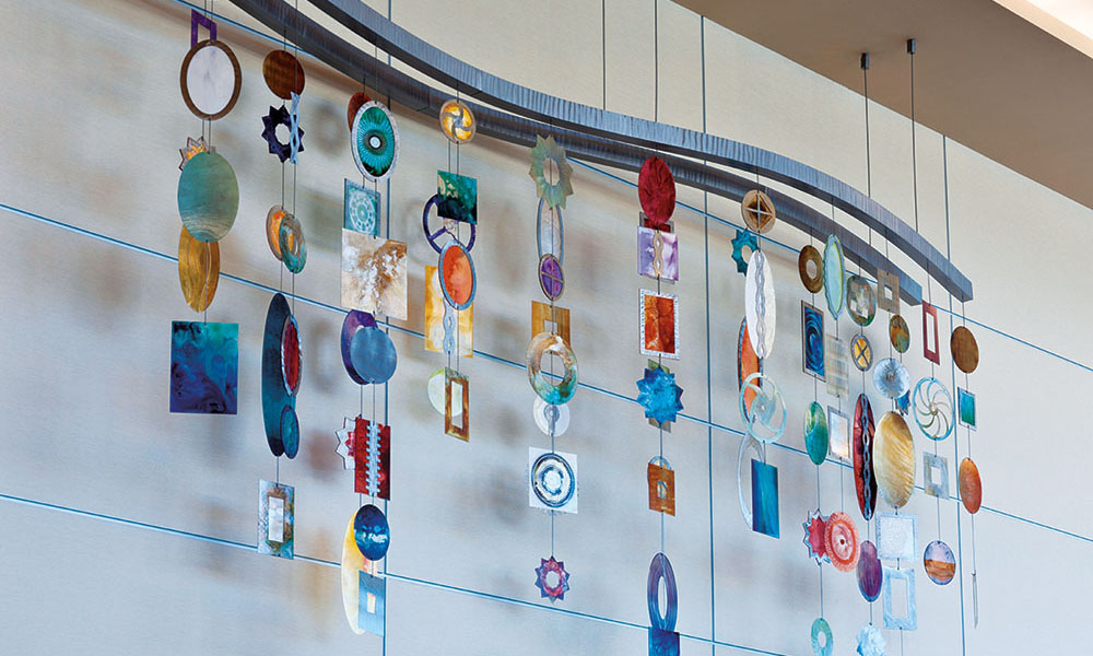
Given the strong industrial ties in the community and its history with textiles, subtle geometric patterns were used, combined with fluid movement, to represent textile patterns and the intricate nature of the process.
Living art program
The interior space benefits greatly from a purposeful effort to support and represent local artists’ works. Niches, focal points and small areas of respite were formed to support different types of art. Such spaces for art bring a sense of community into the space, tying the hospital strongly back to its roots.
Different levels of comfort
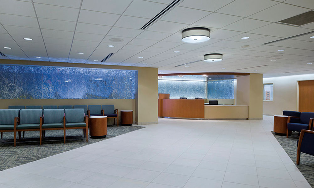
In any healthcare environment, there exists a need for differing levels of comfort. The range of physical and emotional needs that require support creates a number of challenges that can be solved by providing varied waiting spaces. Some space should be considered for the more active user, while others should be quiet and centered. The Lowell General Hospital project recognized this need and provided a series of options, moving from the open lobby, complete with coffee bar, to the quieter sub-waiting areas at the clinics. The main public zone, a combination of open seating and hotel-type amenities, can easily serve the new outpatient service, the oncology center and the main hospital lobby.
Spatial zoning
Understanding that Lowell General Hospital is an urban, academic medical center informed the wayfinding approach. It was determined that the key customer would be more relaxed in an ordered environment — one providing a clear circulation hierarchy and defined destination points. The design team used a series of repetitive features and soft barriers to direct users from the public zones to the patient zones, providing defined areas for different functions. Additionally, the system for initial “meet and greet” was key to the success of the experience. Understanding that perception begins at or even before the front door, a highly-visible, accessible information center was placed in the center of the entry sequence.
Planning for the future
All of these concepts form the interior design approach, but its ability to merge with and transform the existing palette was equally important to its overall success. A new design must live in harmony with the existing facility, strengthening it if possible and providing a vehicle for future adaptation. Significant care was given to ensure the new language could be implemented, in stages, through the existing facility as the budget allowed. The use of subtle colors, natural accent materials and classic combinations ensures this palette survives.
Revitalization projects can be very rewarding. The transformation of an existing community asset into a new experience takes significant design energy and attention to detail. Successfully understanding the client and their institution, combined with a process that allows for significant user input, will allow the design team to create a space that is as unique as the community in which they are working.
Lowell General Hospital’s revitalization project not only re-energized its mission, but reaffirmed an engagement with the community from the inside out.
Authors: T. Scott Rawlings, AIA, FACHA, LEED AP, is a vice president with RTKL’s Healthcare group in Washington, D.C. He has over 19 years of experience with healthcare specialties including cardiac, women’s and children’s, cancer treatment, inpatient environments and campus master planning. Micah Yeck, IIDA, LEED AP, is a designer with RTKL’s Healthcare group in Washington, D.C. Her interest in the measurable effects of designed environments on health improvement have guided her six years of experience with healthcare interiors.
Photos by David Whitcomb
Posted May 5, 2013
More Articles:
- Developments in BIM Virtual Symposium
Dec 3, 2024 – Dec 3, 2024 - Healthcare Environments 2024
Dec 8, 2024 – Dec 10, 2024 - IHI Forum
Dec 8, 2024 – Dec 11, 2024 - Construction SuperConference
Dec 9, 2024 – Dec 11, 2024 - 2024 New Orleans Cluster
Dec 9, 2024 – Dec 11, 2024 - EBD Journal Club: Blue Space: Extracting the Sensory Characteristics of Waterscapes as a Potential Tool for Anxiety Mitigation
Dec 17, 2024 – Dec 17, 2024


