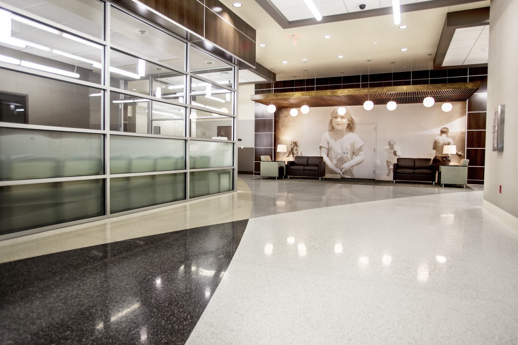
GLASGOW, Ky. — Looking at the photos, you would never guess that the medical facility that now stands in Glasgow, Ky. is the product of a two-year Wal-Mart renovation. The T.J. Sampson Health Pavilion is a project that blends clean, modern lines, innovative design elements and a color scheme that creates a contemporary healthcare oasis.
 The facility houses outpatient services including kidney care, lab services, radiology, rehabilitation, urgent care, women’s health and physician offices. It also serves as a community center with meeting spaces and a walking track that’s open to residents.
“Since we weren’t just designing a healthcare facility, but a place where the community could gather, we wanted our design to reflect a high-tech, bright environment that would maintain a pristine, state-of-the-art look for years to come,” said Pam Faulkner, senior designer and head designer for the T.J Sampson project.
Upon entering the three-story building, which was built in front of the existing Wal-Mart structure, guests are greeted with an abundance of light via floor-to-ceiling windows. Designers kept the space light and fresh by using a soft white color palette contrasted with multi-tonal woods. Custom pendants, all of varying lengths, hang from the wood- tiled ceiling and reflect splashes of light on the soft grey, cream and charcoal Terrazzo flooring.
“The 225,000-square-foot facility is a complete square with a walking track to encourage guests to exercise. To keep it interesting for those using the walking track, we created a random, wave pattern on the floor,” said Faulkner. “This was drawn to ensure that no two areas of flooring were the same. Not only is it visually interesting for those walking, but it also serves as a wayfinding tool that emphasizes a certain direction of traffic.”
A grid system of pine color wood-veneered panels was used throughout the facility. Wallcoverings, LED rope lighting and backlit poly resin wall insets add high visual impact in the open corridor areas.
Occasional seating areas were created for guests and reflect a more traditional look. Designers enlarged photos that depict Glasgow community landmarks, events and people. To make these areas more conversational and comfortable, designers lowered the ceiling height and installed softly lit circular pendants that appear to float. Not only do these provide quiet conversation areas for guests, but also serve as another wayfinding tool as each seating area has a different photograph that helps guests navigate to various locations.
“From inception to completion, this project kept the needs of community members at the forefront,” said Faulkner. “For me, repurposing an existing Wal-Mart was a design first. And this state-of-the-art transformation is one that community members will still be proud of for decades to come.”
Additional team members:
Architect: Stengel Hill Architecture
Contractor: Alliance Corporation
Engineers: CMTA Consulting Engineers


