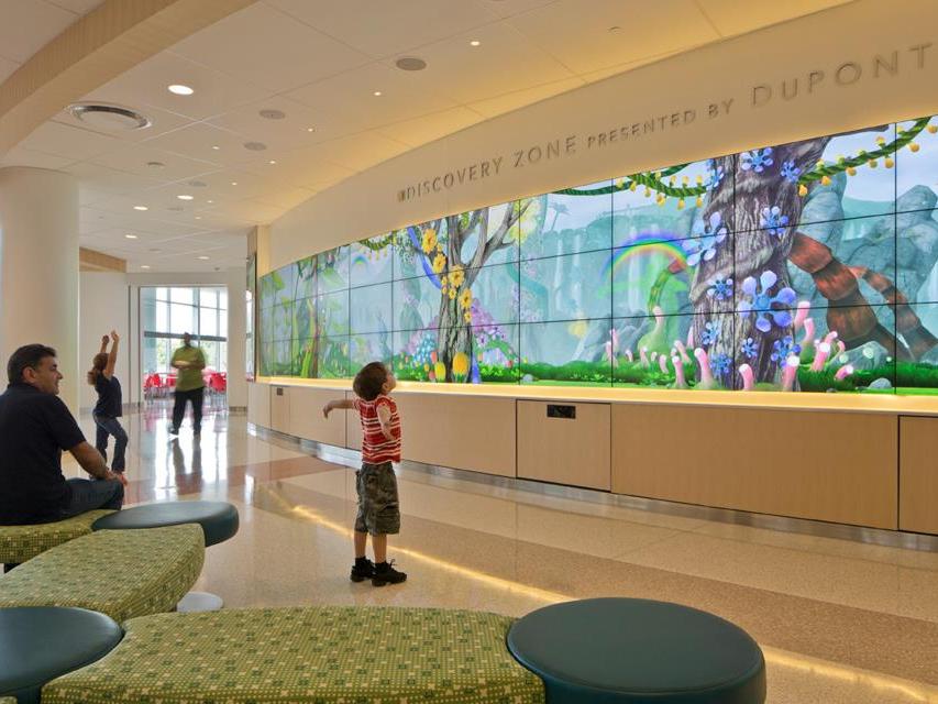
The American Society of Interior Designers has released the latest batch of research in its Impact of Design Series; this time, featuring the Nemours Alfred I. duPont Hospital for Children in Wilmington, Delaware, designed by FKP | CannonDesign. The 548,000-square-foot space uses design to solve problems for staff, patients and caregivers, alike.
Most notably, the effects of the design are tangible when comparing pre- and post-occupancy metrics; the facility’s Monthly Inpatient Environmental Satisfaction Index rose 33.97 percent, the Inpatient Monthly Likelihood to Recommend the Hospital to others top-box score rose nearly 5 percent and the Monthly Overall Rating of Emergency Department Care saw a 10.9 percent satisfaction increase among patient families. Key design elements responsible for these shifts include:
- Massing: The building massing starts with the patient rooms and extends out to the corridors. The atrium acts as the “town square” to welcome visitors and serves as a landmark to enable orientation and ease wayfinding.
- Layout: Each inpatient neighborhood is comprised of six, eight-bed units and a teamwork area — all connected by public loop corridors on each patient floor. Clinical attendant work areas directly off the unit corridors provide a bedside connection to the patient while maximizing efficiency.
- Access to nature: Located on duPont’s 300-acre estate, the hospital is set amid a beautiful park-like setting. The family friendly site is filled with a variety of healing and active-play garden areas. Patient rooms and staff work areas with adjacent “pocket parks,” solariums at building corners and atrium bridges all provide views to the gardens.
- Daylight: The concept of harvesting light and providing views shaped the overall building form while also meeting sustainability goals. Natural light harvesting is an important aspect of promoting wellness, as Evidence-Based Design has shown that natural light and exterior views reduce medication use, support circadian rhythms and reduce depression.
- Positive distractions: Nemours engaged youth advisory groups to provide the input that influenced a “Jumpin” aesthetic — creating an unexpectedly delightful and child-friendly building.
To view the full research brief, click HERE.
Photo courtesy of © 2018 Novità Communications.


