Market and societal influences are driving today’s new colors
The use of color in healthcare settings has evolved over the last five years, influenced by a variety of factors, including global design trends, consumer research, patient satisfaction studies and market drivers from other segments. When it comes to healthcare facilities, we’re seeing less of the stereotypical institutional colors, and more healthcare systems that are influenced by residential design, as well as taking color cues from the hospitality and commercial markets.
By selecting up-to-date colors and using them in the right places, architects, interior designers, facility managers and building owners can make healthcare settings not only look more aesthetically pleasing, but also serve a purpose for those who spend time in them.

Market drivers behind color trends
To better understand how today’s new colors can impact the patient experience in a healthcare setting, professionals can first take a cue from other industry segments.
For example, when a patient enters a hospital room, they want it to feel as at-home as possible. Even though they know it is a hospital, they want to feel comfortable in the space. This is where the latest in residential design is influencing the healthcare segment. Patients are likely to associate soothing colors with comfort, such as the tinted neutrals they might choose for their home.
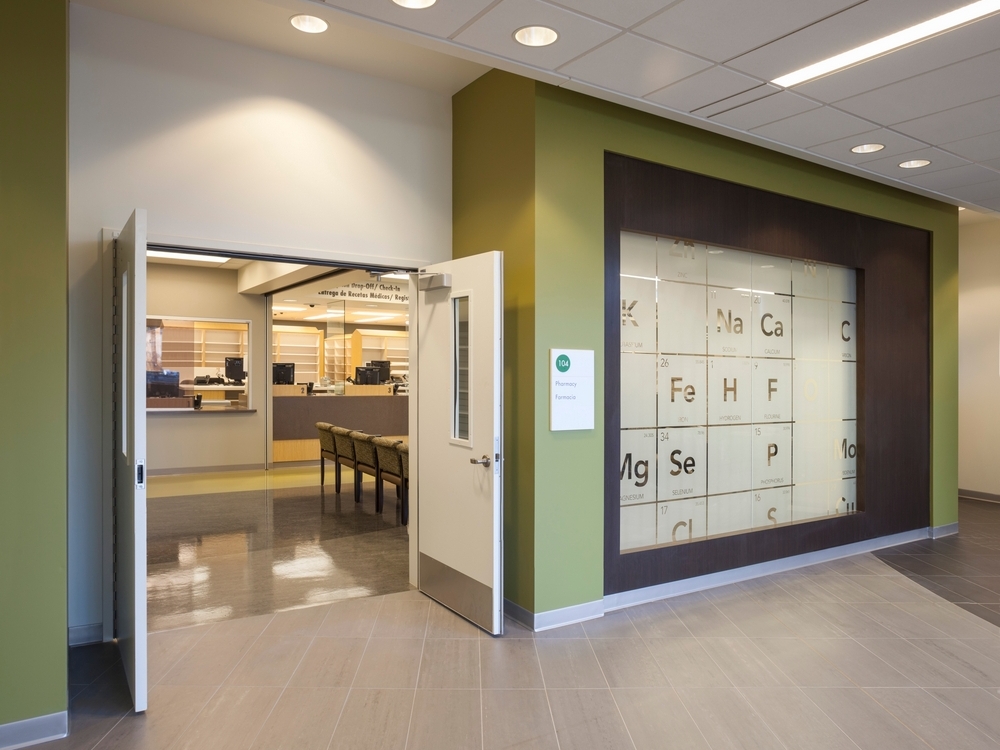
For more public areas of healthcare facilities, using pops of color can add energy to a space and provide visual cues to highlight a specific design element or provide wayfinding throughout a large healthcare campus. Today’s refreshing citrus hues, sometimes seen in office environments, can create this effect in areas such as a focal point in a waiting room, a bold color to designate an elevator area or the entrance to a new wing. These brighter hues can also act as branding for the healthcare system, as seen in some satellite facilities — one bold hue, when paired with a few neutrals, can bring a contemporary design to a healthcare setting.
Many healthcare interiors have already been using nature as a source of color inspiration. This way of thinking has not changed. In fact, it has only grown in popularity among commercial and residential markets. Leafy greens, watery blues and other colors from the natural landscape complement the wood tones that are frequently prevalent in healthcare environments.
Societal color influences
In addition to market segment drivers, societal trends are also impacting color predictions for the year ahead. In this arena, we’re seeing three distinct directions for the healthcare segment in 2018: soft neutrals that provide comfort, uplifting colors that energize and soothing colors that provide a thoughtful distraction.
Composed organics
Among the societal influences impacting this color trend is the growing need for minimalism, mindful living and creating an environment to disconnect and recharge. Serene colors such as soft beiges, light grays and tinted neutrals are all fitting hues for healthcare design.
When making selections for a facility, consider colors that evoke alabaster stone, warm beach sand or the drift of mist over a lake. These colors can be introduced in acute-care units, patient rooms and surgery centers. They can also create a calming atmosphere and help soften other materials and equipment, while maintaining a clean and crisp appearance for the overall space. These colors are the fundamental basics that every interior environment starts with and pairs well with a variety of accent colors.
Focused energy
The trend for bolder colors reflects a need for making connections with new places. People are remapping their sense of community, and even in landlocked cities they are mirroring global experiences through the exploration of new types of foods and crafts. This societal influence is reflected in pops of saturated hues.
Within a healthcare setting, these global colors can be used to bring optimism and personality to a variety of areas. A splash of orange on an accent wall brings youthful energy to a pediatric unit of a hospital or a children’s health clinic. A bright aquamarine blue in a medical center hallway enhances a sense of interest and aids in navigation as patients progress from one appointment to another.
Such brighter tones would best be utilized in smaller doses, so as not to overwhelm patients. However, vibrant colors can be used effectively as a design element to update a space, and can show differentiation between areas. Bolder colors can also be incorporated into the exterior of a healthcare facility as a design element. Using these slightly stronger colors to highlight important walls can help people stay calm and oriented to their surroundings.
Warm welcome

Inspired by biophilia, an intrinsic connection to nature, colors such as peachy-orange persimmon, Aleutian blue and warm golden tones can add visual interest and also lend a helping hand in healthcare facilities. Research shows that warmer tones are appealing to those who need more assistance, such as patients receiving memory care or residents living in senior centers.
For those in the golden years of life, a healthcare environment can be stressful and challenging because age affects the perception of color. As the years go by, our eyes naturally add a tint of yellow to what we see, changing the way colors look and sometimes muddying their perception.
Other factors to consider
Beyond color, today’s advanced paints offer many additional properties that can help maintenance and housekeeping teams keep up with the constant cleaning of all surfaces. Local paint stores can provide advice on the best choices based on the specific healthcare facility’s needs.
Beautiful, purposeful color can transform a healthcare environment. Careful selection of colors throughout a facility will not only enhance the appearance of the space, but will also ensure a more positive experience for all who spend time in it — whether patients, residents, visitors or employees. By making people feel comfortable, at home, safe and in control of their lives, color makes all the difference.
Emily Kantz, interior designer, color marketing & design at Sherwin-Williams, shares color trends for today’s healthcare market: click here.


