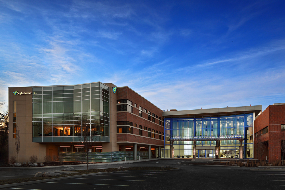
Construction is complete on a new $54-million, 100,000-square-foot, three-story addition to Doylestown Hospital, called the Cardiovascular and Critical Care Pavilion, located in Doylestown, Pennsylvania. The project team included The S/L/A/M Collaborative (formerly CBRE | Heery Design Group), in partnership with Doylestown Health and The Norwood Company. This marked the completion of phase one of a three-phase project.
 The exterior design of the pavilion retains the campus’s signature red brick facades with tinted punched openings, contrasted with the modern look of the clear glass-walled atrium and family waiting areas to blur the boundaries of nature and the outdoors with the interior.
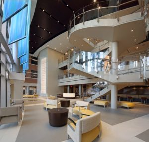
Inside, the atrium presents a heart-healthy lifestyle upon arrival with a café that offers healthy eating and cooking classes. Visitors are encouraged to use the floating stair placed near the entrance that elegantly winds to the upper floors. Moving deeper into the entrance, the lofty atrium gives way to a family waiting room offering the comfort of a fireplace and home-like finishes.
The second floor Center for Heart and Vascular Care is part of the hospital’s master plan, developed by SLAM, and was created to expand the scope and depth of the hospital’s cardiovascular services, bringing the future of medicine to the community using advanced technologies and Evidence-Based Design principles.
Included in the center is a 28 bed-wing, designed as private universal rooms to flex between the hospital’s increasing demand for cardiovascular intensive care and interventional vascular beds. The new three-story glass atrium provides a separate entrance to the center, while seamlessly connecting it to the main hospital to create a “hospital within a hospital.”
The unit promotes safety and noise reduction, as well as efficiency and enhanced workflow of the staff. “Pods” centered around eight patient rooms, four on each side of the bed-wing core, were designed to expedite response time to patient needs, and reduce movement and supplies in the corridors. Staff are able to collaborate in confined glass-walled spaces, while maintaining visual connection to the unit.
While hospitals can’t silence patient alarms, communications between clinicians or the rapid movement of supplies through the corridors, a physical environment was designed that disperses noise, limits its duration and helps contain ambient sound.
In addition, three zones are designed in the patient room to establish designated spaces specific to clinical, patient and family:
- Clinical zone at the entrance to the room presents a hand-washing station for ease of use as staff and family members enter and exit to reduce infection.
- Patient zone focuses around the patient’s bed, with the entrance to the toilet room positioned on the headwall to reduce travel distance and risk of falling.
- Family zone is furthest away from the door and provides a large window to nature. Inside this zone is a pull-out sofa encouraging 24-hour stays so the family can be part of the care team. It also provides a place to retreat from the patient zone and out of the clinician’s way when needed.
At the end of the unit is a large family area with home-like amenities. Respite rooms offer private space to release emotions and to find consolation.
Photos courtesy of Matt Wargo.


