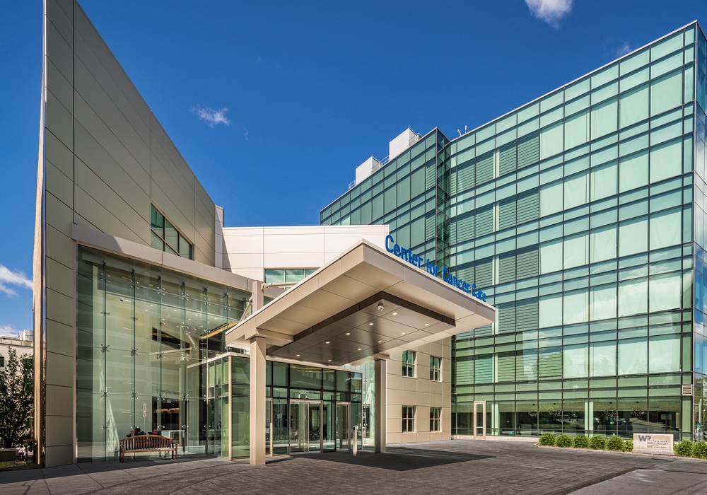
The renovated and expanded Dickstein Cancer Treatment Center at the White Plains Hospital campus in New York was recently unveiled. Designed by Posen Architects and built by A.P. Construction, the project features a new six-story structure and architectural design focused on supporting the best medical outcomes.
 The new building meets the desired increase in infusion capacity from 18 to 35 stations, creates 30,000 square feet of space for doctors’ offices that had previously been offsite and incorporates a new United States Pharmacopeia 797-compliant pharmacy. Just as cancer specialists and patients had desired, doctors and patients have ready access to each other on one cohesive, modern site.
Five key design elements that directly support the center’s goals are:
1. A vision for one campus
Early development scenarios to accommodate the hospital’s growing outpatient cancer treatment needs centered on offsite or satellite options, but one solution brought patients, doctors and all hospital services together on the existing campus. The project team saw opportunity in the tight footprint of an abandoned four-story building on the edge of the hospital campus. The design overcame site constraints that made it a less obvious solution to others.
2. Fully compliant, modern spaces
Both the renovations to the existing Dickstein Building, constructed in 1999, and the construction of the new, 38,500-square-foot expansion, are fully compliant.
3. Construction sequenced to minimize disruption
The Dickstein Building remained open at all times throughout its renovation and construction of the new space; specialized engineering precautions were taken to prevent construction-related vibration from impacting the precision-based treatments that continued in the lower-level radiation oncology department.  Temporary, nearby off-site locations served as oncology department medical and administrative offices, phased to minimize inconvenience to patients, staff and visitors.
4. User input incorporated into design
Visioning sessions were held with staff groups and a patient survey was conducted. Various patient experience scenarios were fully explored, from entry and movement through the building on a treatment-only day to a doctor-visit-and-treatment day; staff movements were also examined to keep oft-needed items within easy reach. Connections between the first, second and third floors of the new and existing buildings further ease doctors’ access to their patients. The hospital was researching and rolling out a new technology system simultaneous with the building design, so Posen accommodated needs of the technology department and end-users with great flexibility during the design process.
5. Research, case studies help guide design decisions
Naturally lit space and access to nature views were high priorities for the design, based on user preferences, design aesthetic and case studies. The building’s glass façade brightens and cheers the interior spaces. Another design decision was the recognition of varied patient preferences in regard to open or private treatment bays: with the knowledge that patient choice leads to better patient outcomes, a combination of such treatment areas was incorporated.
Images courtesy of Rob Faulkner.


