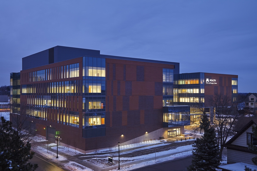
The new University of Minnesota Health Clinics and Surgery Center is designed to elevate an inter-professional care delivery model. Inside the brick and terracotta façade is a new type of patient experience that introduces improved patient flows and turnaround of outpatient procedures. The five-story, 342,000-square-foot outpatient and ambulatory care center in Minneapolis, Minnesota is designed by CannonDesign and built by McGough.
 The facility was designed with ideas pulled from other consumer industries, including retail and air travel to orchestrate a patient experience that promotes personalization, convenience and the elimination of touchpoints.
Key examples of cross-market influences include:
- Inspired by retail design and specifically Apple Stores, the center features no formal check-in or check-out areas. Instead, patients are greeted by a staff member with a mobile device capable of checking them in, filling out health forms, finding their exam room and scheduling future visits.
- Modeled after the check-in procedures for airlines, patients can check in from home to eliminate the need for a formal check-in process.
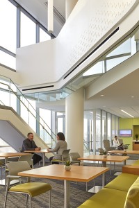
- Contemporary workplace strategies were leveraged. In lieu of space allocated to private offices that tend to be empty up to 90 percent of the time, the new facility features touchdown spaces and enclosed offices, which can be reserved for slots of time, but are not designated for one individual. Underutilized space can be reallocated toward collaborative and social staff areas, which take advantage of abundant daylight and views of the campus.
Highly flexible and adaptable clinical modules were designed to accommodate changes in program development, best practices and innovations over the decades ahead. These modules further promote M Health’s inter-professional care model, which brings medical, research and education professionals together for collaboration and teaching.
Brick and terracotta on the exterior complement the local architectural landscape and native geology. Inside, patterns of travertine stone and glass panels allude to the exterior, and materials and planes are applied in a way that bring visual cohesion to the massive amount of activity taking place in the building. Color is used strategically throughout the space and in the furniture to identify clinic entry and neighborhoods in support of intuitive wayfinding. The artwork in the facility comes from local artists who submitted designs consistent with the building’s architecture and then selected via a competitive process.
Photos courtesy of Craig Dugan Photography


