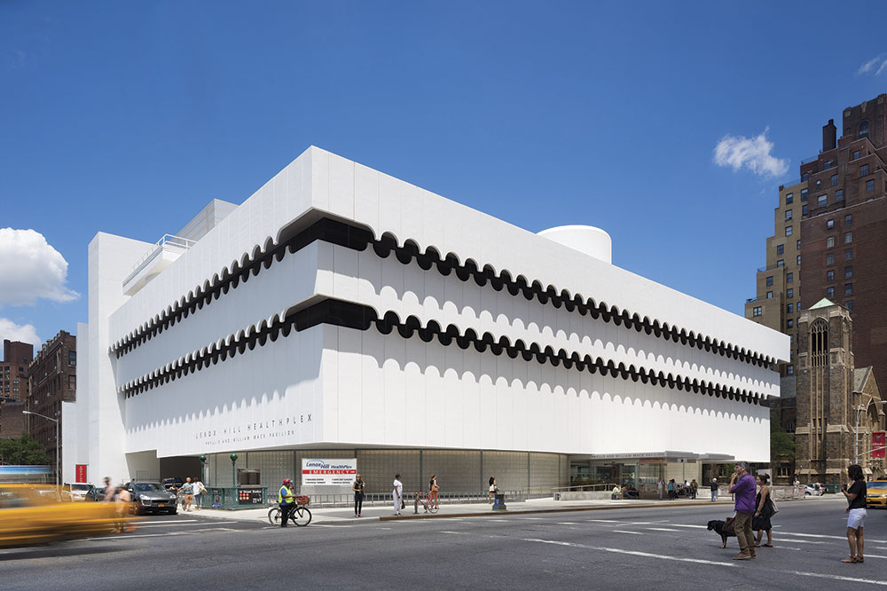
In 1964, Albert Ledner, a student of Frank Lloyd Wright, completed his largest and most high-profile collaboration with the National Maritime Union — the Joseph Curran Building in Manhattan’s Greenwich Village. It was key to creating a modern image for the union.
The building was bold in its ship-like design, in its deference to circular forms (importantly illustrating fairness and equality) and in its stark contrast with the more historic architecture that typifies the area. Its concrete walls appear to float above curved glass blocks and scalloped portals that enclose increasingly cantilevered upper floors.
The Joseph Curran Building was eventually sold and renamed the Edward & Theresa O’Toole Medical Services building. It was transformed on the inside into a maze of outpatient clinics and medical office spaces with low headroom, bearing no resemblance to the original expansive hiring hall with soaring, double-height ceilings. When the facility closed, it left the neighborhood without even these medical services.
Repurposing for modern-day medicine
In 2010 North Shore-LIJ Health System approached Perkins Eastman to design a freestanding emergency department that would serve Greenwich Village as an adjunct to its flagship hospital in Manhattan located uptown, Lenox Hill Hospital. The organization had identified the former Joseph Curran Building as the place to locate this building type. However, the building was far from ready and two challenges were immediately apparent:
>
Development of a program for the first freestanding ED to be constructed in Manhattan
>
Adaption of a unique building to serve a completely different purpose than originally intended
Unique requirements governed the planning of a freestanding emergency department, a building type not identified in prevailing NYS Department of Health regulations. These requirements included the need to provide two 23-hour-stay patient rooms, enhanced diagnostics and an enlarged ambulance bay, including one position for a 24-hour standby ambulance to transfer high-acuity patients to a full-service hospital. The renovations needed to meet programmatic requirements necessitated a lengthy compliance process made more complicated by its location within a historic district.
Another major planning challenge revolved around fitting the orthogonal plan typical to healthcare programs into the existing circular footprint. The renovated plan maintains the important circular condition, while carefully adjusting the interior space into a more traditional orthogonal organization for healthcare programs.
New heights of welcoming care
At the main patient walk-in entrance, significant vestibule was added in frameless glass, including handicap ramps. The square, clear glass vestibule with illuminated glass canopy breaks up the circular geometry and the translucency of the glass base original to the design, while it “opens” the ED to the street and neighborhood and provides clear visibility for those rushing for treatment.
The main entry and reception area support the client’s goal of enhancing patient convenience and access to emergency care. To that end, these functions can be thought of as a concierge — a nurse greets patients at a semicircular reception desk and immediately directs them to triage positioned just inside the new vestibule to provide immediate assessment, along with a direct connection into treatment areas.
A distinctive circular ceiling highlights arrival and recalls the original circular core and entry lobby for the National Maritime Union headquarters offices located on the sixth floor. Flanking the reception area are two patient waiting spaces. The narrow configuration of these waiting areas responds to the patients’ ability to enter an exam room directly from the waiting rooms, reducing waiting times. Here, the perimeter cast-in-place terrazzo benches were restored and updated with soft seating and arm rests.
The main ED space was configured into a racetrack plan with treatment rooms surrounding an open work/nurse station area that provides visual control from staff positions. Centrally located between the two nurses’ stations, a “results waiting” area gathers patients waiting for lab results or discharge — freeing up exam rooms for those with more emergent needs. The individual booths offer privacy through partial walls with frosted glass — though still in the sightlines of nurses — and comfort with semi-recliners and iPads for entertainment or education.
The ceiling in this section was restored to its original height; the design team “adapted back,” removing portions of the second floor/mezzanine added by the previous tenant in order to reveal the uplifting double-height space that had been the NMU hiring hall.
Embracing maritime cues
Throughout, the interior design takes inspiration from the original building’s nautical themes — soothing greens and blues recall the sea, teak walls and columns recall a ship deck or promenade. Lighting fixtures evoke a ship’s portholes or ephemera of the sea — and Ledner’s prominent use of the circular form.
In the main ED space, the interior design is deployed to dramatic, but soothing effect through the introduction of three suspended, curved ceiling planes that emulate a ship’s sails. The panels diffuse interior lighting, are acoustically treated to dampen the noise of a busy city emergency room and hide a number of MEP systems. To thread the multitude of ducts throughout the building, the original circular core for vertical distribution was repurposed. Additional features are:
Exam rooms: The 26 exam rooms (including two 23-hour-stay rooms) are individual treatment rooms rather than open bays to promote privacy.
A third entrance: for access to the building’s upper floors. Upon completion in 2015, it will house outpatient services and support spaces.
Trauma rooms: Two trauma rooms, designed to accommodate up to five patients, are located just inside the ambulance entrance. A sliding glass door between rooms allows for the medical team to treat multiple patients in each room at the same time.
Ambulance bay: A covered off-street ambulance bay on the south side of the building provides a distinct entrance to the opposite end of the emergency department, with immediate access to the trauma rooms. It includes a discrete entry for sexual assault patients. To accommodate off-street ambulance unloading and parking, portions of the exterior wall had to be removed. The cast-in-place shear walls that enclosed the building’s western core were cut and re-framed with steel.
Preserving history
The aging, crumbling façade presented another opportunity for the transformation of the building as a remnant of another time into the vibrant home for a high-tech emergency department. After researching and probing the façade, the peeling ceramic tiles (not original to Ledner’s design, 1-inch tiles were bonded to the exterior concrete panels per a maintenance consideration by NMU officials in 1966) were removed and restored to their original finish.
The Landmarks Commission mandated retention of the glass block façade — a distinctive feature of the building’s original design — that encloses the perimeter waiting and patient rooms. The design team rebuilt the exterior walls with same-sized glass blocks that include a fibrous glass insert to provide privacy and increase energy performance. In order to accommodate the required program, the radius of the curved glass brick wall at the north changes. This change from the original glass blocks becomes much shallower to accommodate the program. This newly defined glass block wall also incorporates a change to the pattern to differentiate from the original, and provides a subtle cue to the adaptive reuse of the original building program.
In case of emergency
In the event of a large-scale emergency, the waiting room can be used as a triage area. In fact, the facility was presented as a case study on how New York hospitals might (and were then) prepare for a possible Ebola pandemic.
While the facility is not designated by the city as a disaster triage center, it can be utilized as such like other similar facilities in the city. The spaces were planned and designed to be able to accommodate this use in the event of need. This included the need for materials throughout that could be easily cleaned and disinfected to limit the spread of infection. For instance, the flooring materials in the lobby and treatment areas are monolithic and have sealed joints. The team treated it as a design opportunity, as well; interlocking circles, again in soothing blues and greens, evoke Ledner’s original design vision and goal.
From a hiring hall to place of healing, the Lenox Hill HealthPlex returns the building to its original intent as a place of fairness and equality, resuscitating a midcentury modern building for a truly progressive purpose today.
Project Team: Lenox Hill HealthPlex Project Team
General Contractor: Turner Construction
Architect: Perkins EastmanStructural Engineer: Robert Silman Associates
Electrical & Mechanical Engineer: Bard, Rao + Athanas Consulting Engineers
Fire/ Life Safety: Bard, Rao + Athanas Consulting Engineers
Lighting: Bard, Rao + Athanas Consulting Engineers
Interior Design: Perkins Eastman
Acoustics: Cerami & Associates
Civil Engineer: Langan Engineering
Transportation: Sam Schwartz
Vertical Transportation: VDA
Medical Equipment Planning: Louis Sgroe Equipment Planning, Inc.
Graphics: Russell Design


